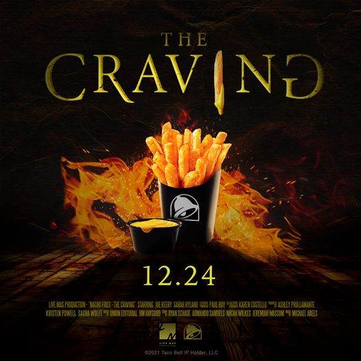
Here is an advertisement from Taco Bell promoting the Nacho Fries.
I think this is a fantastic ad for many reasons. The First reason is my love for Nacho Fries. The ad shows many wonderful things that I wanted to talk about. The creativity used in this is just awesome. It is shown as if it were the poster for a horror movie but in reality it is just Taco Bell’s Nacho Fries.

In blue Circled the Alignment of the product being advertised, The Nacho Fries. Front ant Center they did a great job of clearly displaying the product.

I circled what I saw as repetition. It keeps the theme of the scary movie poster and the colors throughout the photo. Also I think the “i” in craving as a fry dripping in nacho cheese is a nice touch!

I love proximity shown with the Nachos cheese and the fries right next to each other.
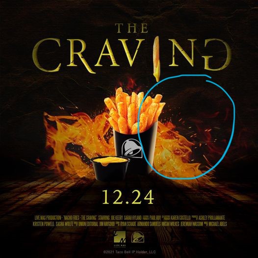
In this circle it demonstrates a majority of the color involved which I think really makes the image stand out. It is the golden orange of nacho fries and flames. This is a warm color which is nice to see during the cold months. It shows that the nacho fries are coming 12/24 which is in a colder season. It is also interesting because when I first saw this ad it was in the beginning of December when you see a lot of bright Christmas colors. This stood out at the time because it was different. It was the dark background and the fire orange.
In conclusion I think this is a very clever ad and very well done.
